Follow these simple formatting tips to elevate your next case competition submission!
Make these changes to elevate the quality of your case competition submissions, simple changes go a long way
Neeraj Subbanna•••2 min read
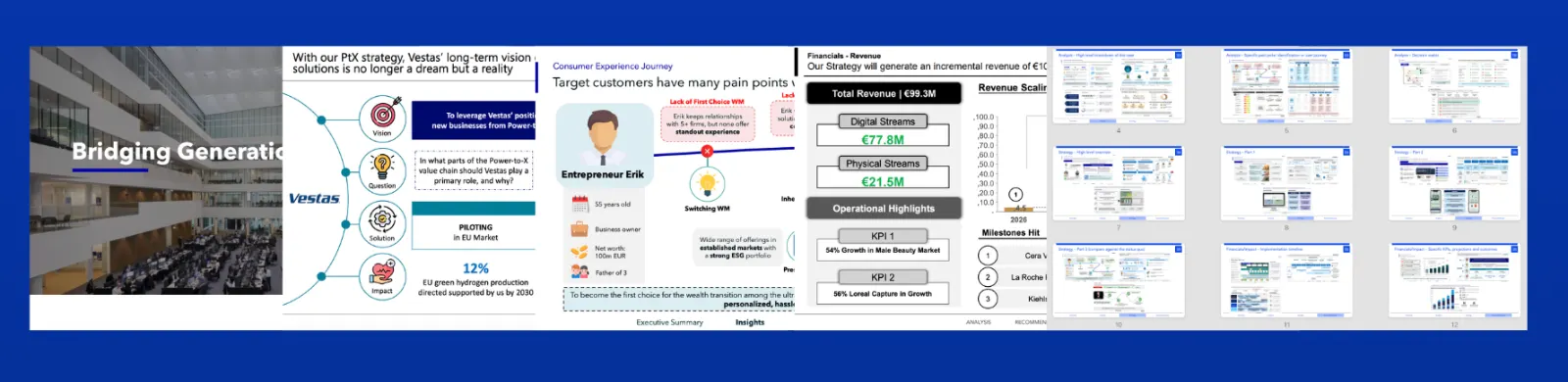
Introduction slide with headshots and names: Pretty straightforward following the picture below, you want to have a nice slightly dimmed background, team and competition name across the lower left of the slide with each members headshots and corresponding names along the bottom right of the slide. Ensure it’s either not too big or too small.
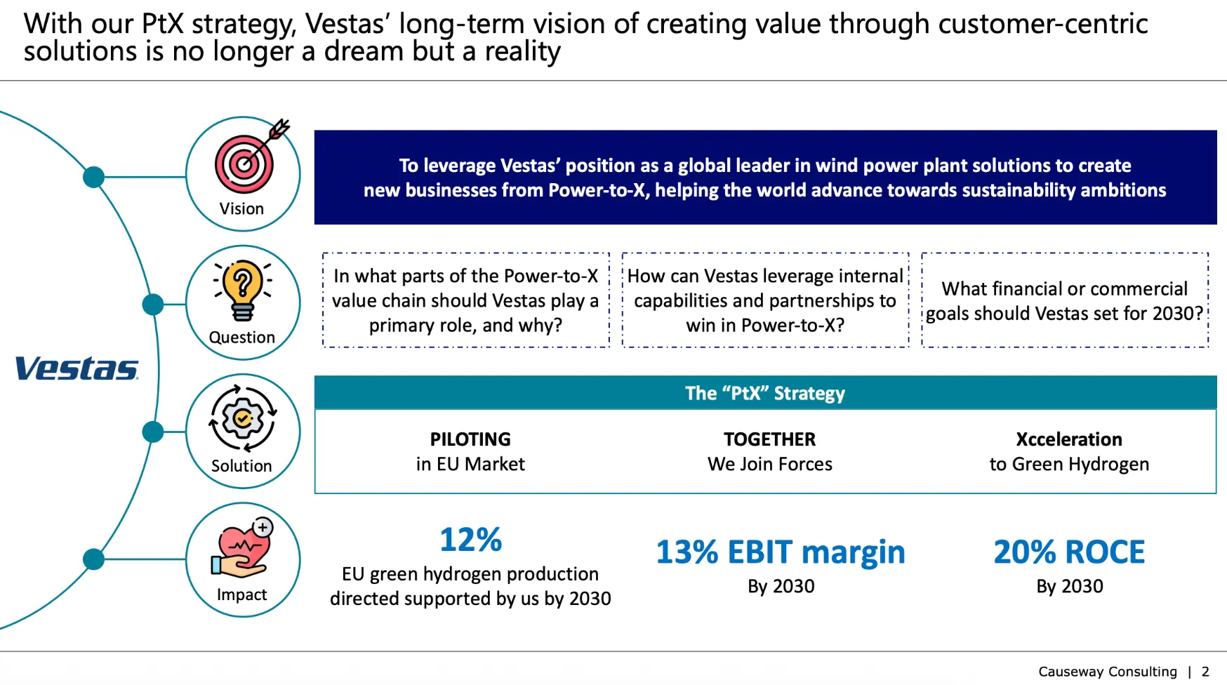
Executive summary slide: Another straight forward one, refer to the picture below. However a great executive summary includes these four things; - The outcome and vision of what you're going to achieve, deliver the impact immediately, don't leave it for later - Two or three key considerations or important aspects raised in the case brief - Your strategy overview in a singular sentence - Finish off with three key quantitative impacts
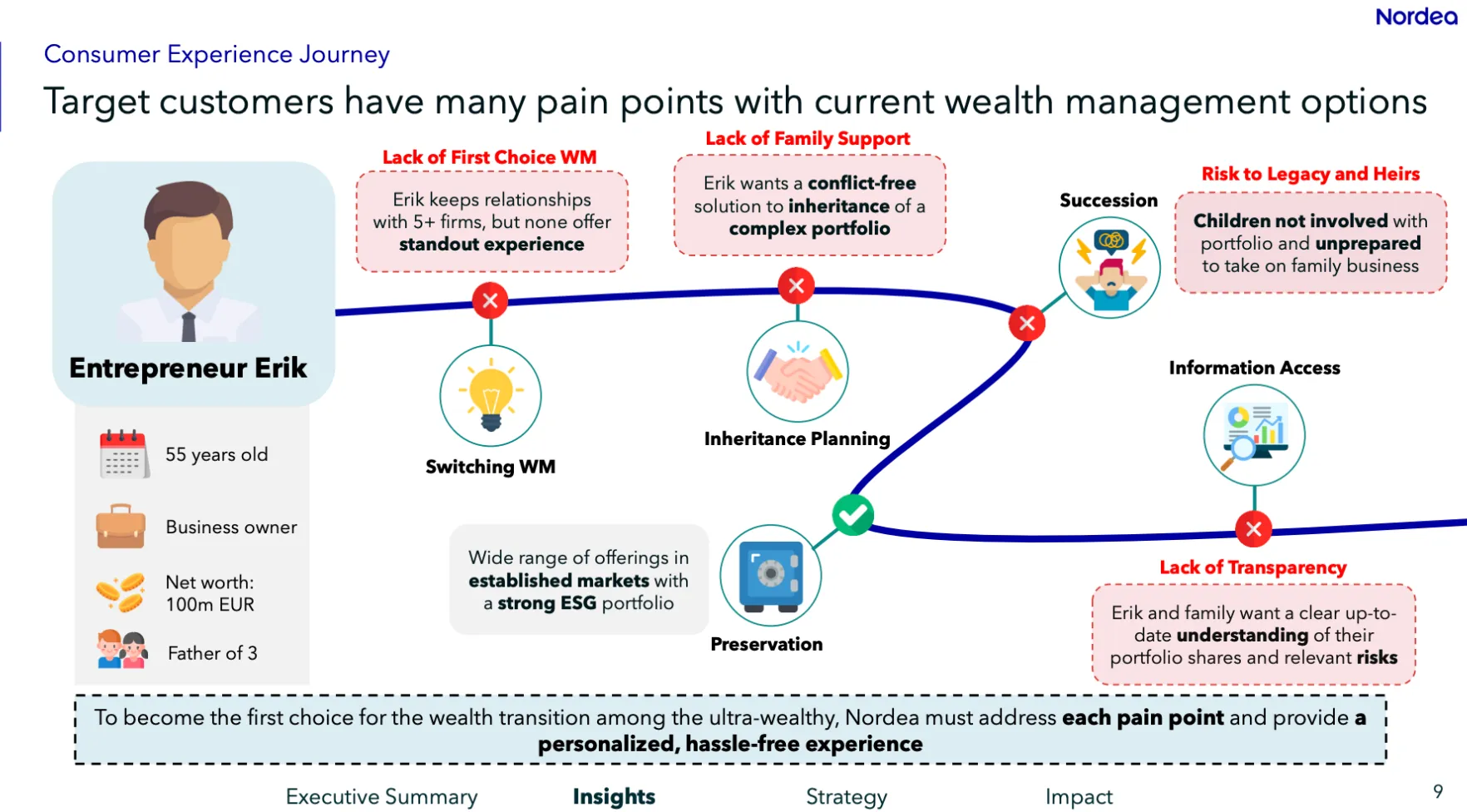
Left to right design vectors: (Almost) everyone reads left to right, so designing your slides with a left to right methodology is critical to reduce the cognitive load judges face when interpreting your slide. Examples of this are having a customer journey slide progress from left to right, although up to down or diagonally also help. Another example is a decision tree that branches out, you want to have all those diverging branches spread out across to the right side of the slide.
Slide master for consistent title, logo, ticker, slide number placement: Having your title's, logo's, ticker's, slide number's bouncing around in different places each time you flick through the slide really takes away from the overall aesthetic experience. Slide master helps you have consistent placement of repeated elements. I'd encourage you to play around with this feature on powerpoint, there are plenty of guides out there which break it down further.
Having a slide ticker: To the bottom of your slide add a ticker, to show what each specific slide is (see picture attached below), you can set this up in slide master as mentioned previously.
Numbering slides: Need I say more?
Consistent icon's: Using websites like flat icon are ideal here and by using consistently similar looking logo's in terms of colour/color (for my US folks), line thickness and other design similarities maintains a more cohesive and consistent approach.
P.S. as a bonus check out our exemplar/winning slide example template which will help you put this all together and see how this advice above is actually applied, click here!
New to competitions
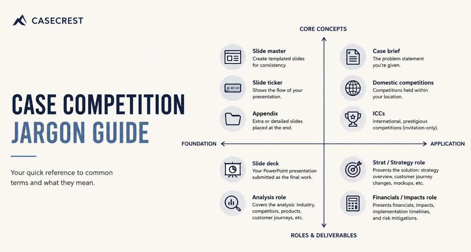
Case competition jargon and technical terms!
You might hear weird words and phrases and things thrown out when it comes to case competitions, so this is your guide breaking it all down.